Repository navigation
feat: headless useESignature hook and ESignature theming for RN and web - #60
Merged
Merged
Conversation


Extract the signing state machine (acquisition, offline check, WebView
events, session-expiry restart, success delay) into useESignature so a
host can trigger signing from its own UI and place the WebView itself.
ESignature becomes a thin default UI over the hook and gains theme,
styles, and labels props; the default look and copy are unchanged.
Mirror of the RN change: the signing state machine moves into
useESignature, which hands back an embed descriptor (iframe props, or a
callback ref for DocuSign.js-mounted sources) so a host can render its
own UI. The DocuSign.js mount now waits for the container to attach
instead of assuming it exists on the first signing render. ESignature
becomes a thin default UI with theme, styles, and labels props; the
default look and copy are unchanged.
Each demo gains a HookSigning screen built on useESignature with the
host's own buttons and WebView/iframe, toggled from the toolbar. The
default ESignature UI stays the initial view so the Maestro and
Playwright flows are unchanged.
READMEs gain Theming and Headless usage sections; architecture pages,
source tree, integration notes, CLAUDE.md/AGENTS.md, and the component
hierarchy diagram reflect the hook + default-UI split.
Three uniform SVGs (default, themed, headless) under docs/images, each
showing the idle screen and which layers the library versus the host
owns. Static assets, not mermaid, so they live outside docs/diagrams.
Move the path illustrations to docs/assets (where readme-hero.svg
already lives) and reference them from the root README as well.
Two-line rows so labels and notes never collide, five identical slots
in every column (the unused ESignature slot is drawn dashed on the
headless path), and a taller canvas with the legend in its own band.
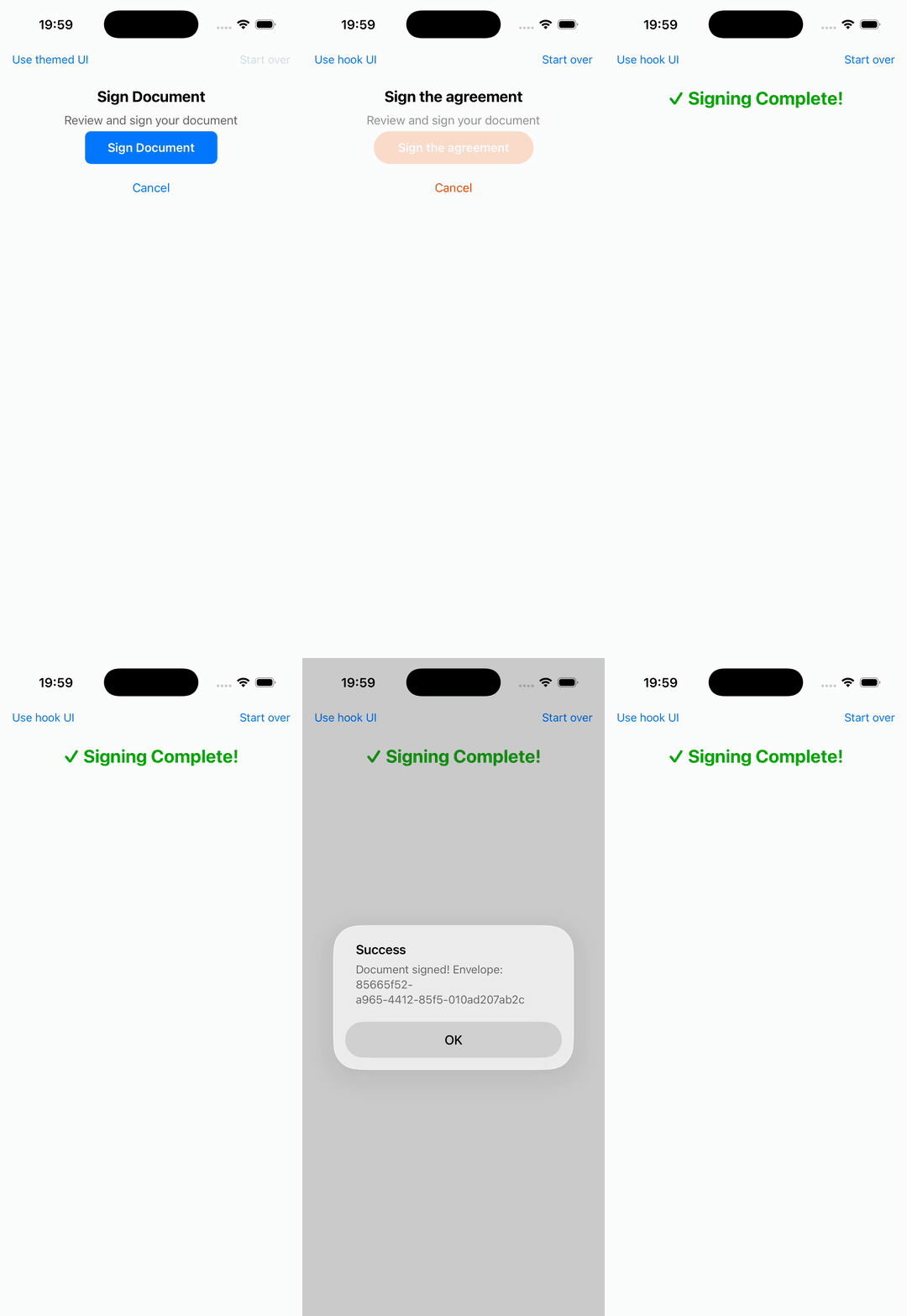
The toolbar now cycles default → themed → hook. Themed renders the
stock ESignature with Blink's palette (orange primary, pill buttons)
and the label a consumer actually asked for, so the theme props can be
seen on a device without any host code beyond three props.

Collaborator
Author
|
Demo of the themed path on the iOS simulator (mock provider): stock component in the default blue → toolbar switch to the themed mode → same component with Blink's palette (
The demo app's toolbar now cycles default → themed → hook (dfa3cb6); themed is three props on the stock component: <ESignature
source={source}
label="Sign the agreement"
theme={{ primaryColor: '#fc5805', primaryTextColor: '#FFFFFF', mutedTextColor: '#9292A0', successColor: '#00A700', warningColor: '#ffad0d' }}
styles={{ button: { borderRadius: 50, paddingHorizontal: 32 } }}
/>GIF lives on the |
Cover buildSource for every ESIGN_MODE by mocking the config module per
test, the Web Forms fetch success and failure paths, the in-flight
reconnect label, and the non-dev recipient. The RN mode resolver becomes
a function because Babel inlines ESIGN_MODE at transform time. Coverage
thresholds on both demos move from floors to 100%; docs updated.

Merged
4 tasks
This file contains hidden or bidirectional Unicode text that may be interpreted or compiled differently than what appears below. To review, open the file in an editor that reveals hidden Unicode characters.
Learn more about bidirectional Unicode characters
Sign up for free
to join this conversation on GitHub.
Already have an account?
Sign in to comment
1 participant

Add this suggestion to a batch that can be applied as a single commit.This suggestion is invalid because no changes were made to the code.Suggestions cannot be applied while the pull request is closed.Suggestions cannot be applied while viewing a subset of changes.Only one suggestion per line can be applied in a batch.Add this suggestion to a batch that can be applied as a single commit.Applying suggestions on deleted lines is not supported.You must change the existing code in this line in order to create a valid suggestion.Outdated suggestions cannot be applied.This suggestion has been applied or marked resolved.Suggestions cannot be applied from pending reviews.Suggestions cannot be applied on multi-line comments.Suggestions cannot be applied while the pull request is queued to merge.Suggestion cannot be applied right now. Please check back later.
Why
The
ESignaturecomponent hardcoded every color and string (iOS-blue buttons, "Review and sign your document", "Cancel", ...) and the only customization waslabel. There was also no way to start the signing flow from a host's own UI: the state machine (offline check,source.start(), WebView/iframe embed, session-expiry restart, success delay, error mapping) was welded to the built-in screens. Esaú hit the first problem ("it would be great if the library allowed changing the button colors"); the second is the underlying design issue: the library should own the protocol and the state machine, not the chrome.What
Headless hook, both packages. The state machine moves into
useESignature(options), exported from@blinkbitcoin/esign-react-native(and its Apollo-free/webformsubpath) and@blinkbitcoin/esign-react. It returnsstatus,error,isSessionExpired, the actionssign/cancel/retry/restart/checkConnection, and an embed handle:webViewPropsto spread onto the host's ownWebView(plusisCheckingConnection).embed, either{ kind: 'iframe', iframeProps }or{ kind: 'mount', ref }for DocuSign.js sources. The mount effect now waits for the container to attach via a callback ref instead of assuming it exists on the first signing render.Thin default UI with theming.
ESignatureis now a consumer of the hook and gains three optional props:theme(primaryColor,primaryTextColor,mutedTextColor,successColor,errorColor,warningColor),styles(per-element overrides), andlabels(copy overrides;title/signdefault tolabel). Precedence is base < theme < styles. Esaú's ask becomestheme={{ primaryColor: '#F7931A' }}.No breaking change. Existing props keep working and the default look and copy are byte-identical. All testIDs are unchanged, so Maestro and Playwright flows are untouched.
Demos. Both demo apps gain a
HookSigningscreen (host-owned buttons + WebView/iframe over the hook) behind a toolbar toggle; the default UI stays the initial view and the E2E target.Docs. READMEs gain Theming and Headless usage sections; architecture pages, source tree, integration notes, CLAUDE.md/AGENTS.md, and the component-hierarchy diagram reflect the split.
Tests
useESignature.test.tsx, component tests cover screens + wiring + theming,theme.test.tsxcovers the resolvers, and each package has a hook-only consumer test that never importsESignature.npm run typecheck,npm run lint,npm test(all workspaces),npm run build && npm run check:packages,make docs-checkall green locally.